Back to Packaging
Packaging
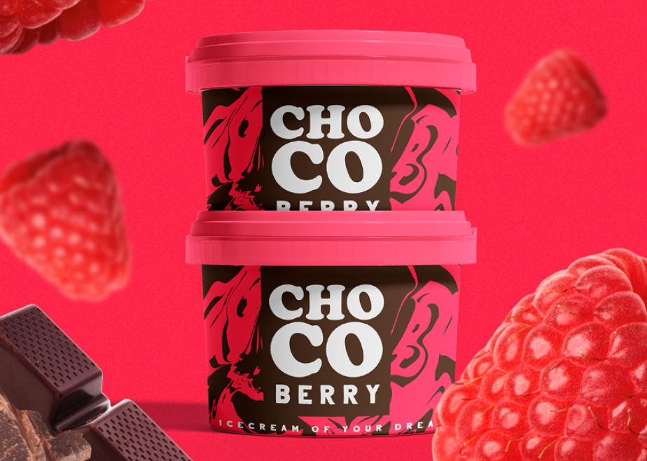
ChoCo Ice Cream Packaging
A vibrant, flavour forward packaging system for an ice cream brand built to stand out on shelf and make you want more.
PackagingLabel DesignBrand Identity
Client
Daniel Wilington
Year
2025
Duration
2 weeks
Role
Packaging Designer
About the project
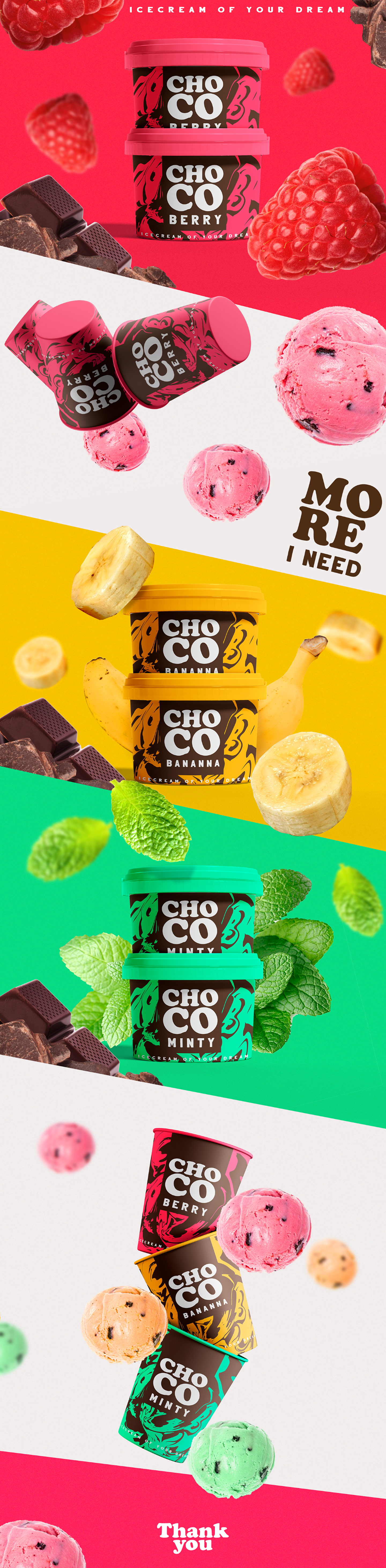
ChoCo needed packaging that did the selling before a single scoop was tasted. Each flavour gets its own bold color world, Berry in red, Banana in yellow, Minty in green, anchored by a consistent typographic system and playful ingredient photography. The result is a cohesive range that pops on shelf, communicates flavour instantly and carries a personality that is as fun as the product itself.
Outcomes
- Full packaging system designed across multiple flavour variants
- Distinct color coding per flavour with consistent brand architecture
- Label design applied to cup and tub packaging formats
Gallery