Pulse App: Designing for Calm in a Noisy World
A complete UX overhaul that turned frustrated users into advocates
+35%
Onboarding Completion
3.1 → 4.8★
App Store Rating
+89%
Daily Active Users
-52%
Support Tickets
The Challenge
Pulse's original app had a 68% drop-off rate during onboarding, and users described it as "overwhelming" and "cluttered." Despite strong functionality, poor UX was killing growth and causing serious user frustration.
The Approach
I led a research-driven redesign focused on progressive disclosure — revealing complexity only when users are ready for it. Every decision was validated through usability testing, with 3 rounds of testing with 8 users each.
Project info
Tools used
Design process
Research
Analyzed 500 session recordings, conducted 12 user interviews, and ran a survey with 200 existing users to identify pain points and motivation patterns.
IA & Flows
Restructured the information architecture from scratch. Reduced primary navigation from 7 items to 4, creating a clearer mental model aligned with user goals.
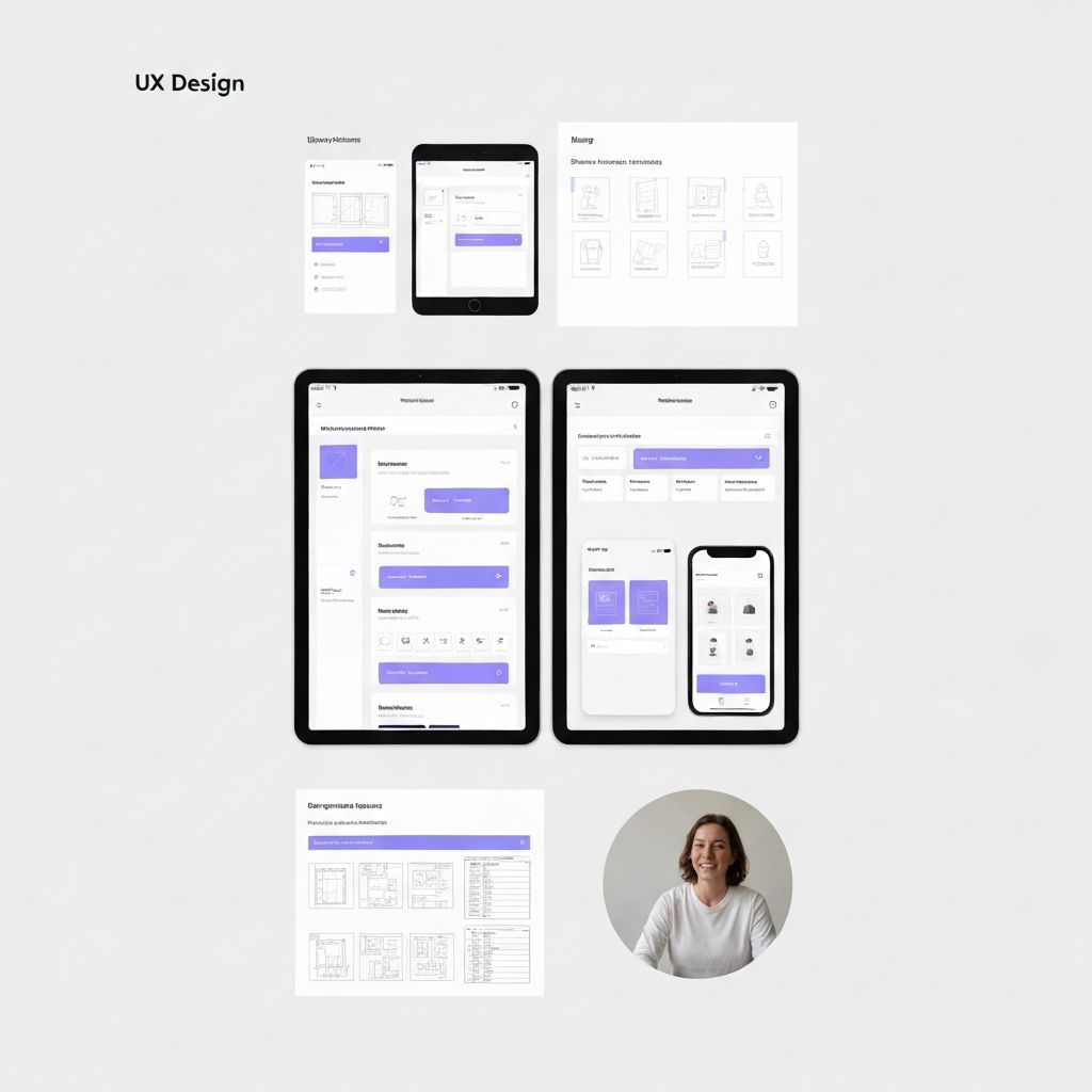
Wireframing
Produced 60+ wireframe screens covering all primary and secondary flows. Tested paper prototypes with 6 users before moving to high-fidelity.
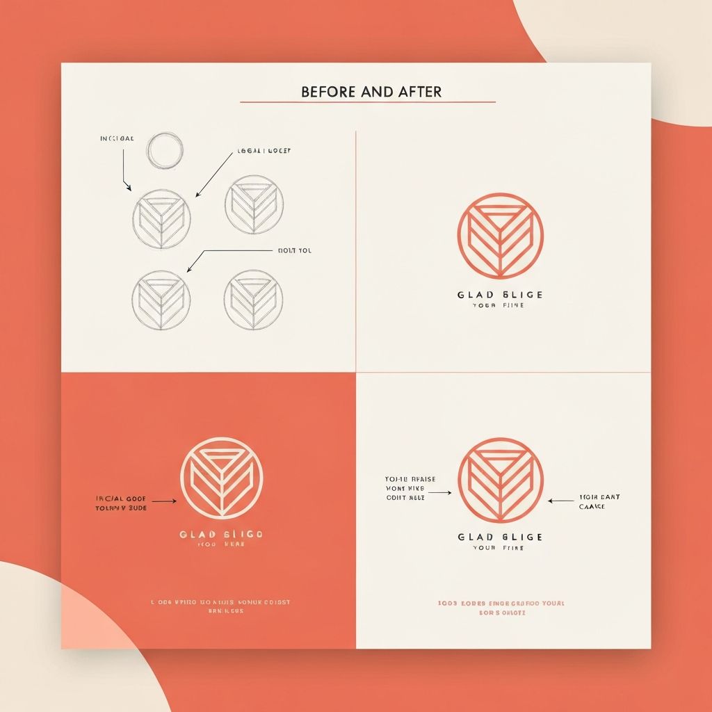
Visual Design
Developed a calm, minimal visual language using generous whitespace, warm neutrals, and subtle coral accents. Built a complete component library in Figma.
Prototype & Test
Created interactive prototype covering 3 key user journeys. Ran 3 rounds of usability testing, iterating between each round based on findings.
Results
+35%
Onboarding Completion
3.1 → 4.8★
App Store Rating
+89%
Daily Active Users
-52%
Support Tickets