Rebranding Lumina: From Generic to Iconic
How a brand identity transformation doubled customer retention
+60%
Brand Recognition
+2×
Customer Retention
72 → 89
NPS Score
+140%
Social Followers
The Challenge
Lumina had an outdated, generic visual identity that failed to communicate their premium positioning. Customers confused them with mass-market competitors, and their brand recognition was near zero despite having exceptional products.
The Approach
Starting with deep discovery — competitor audits, customer interviews, and brand positioning workshops — I uncovered a clear differentiation opportunity: Lumina's philosophy of "science meets soul." This became the foundation for the entire visual system.
Project info
Tools used
Design process
Discovery
Conducted 15 customer interviews, 3 brand positioning workshops, and comprehensive competitor visual audit across 25 brands in the premium skincare segment.
Strategy
Defined brand personality (Intelligent, Warm, Elevated), identified core visual codes, and established a positioning map that placed Lumina uniquely between clinical and luxe.
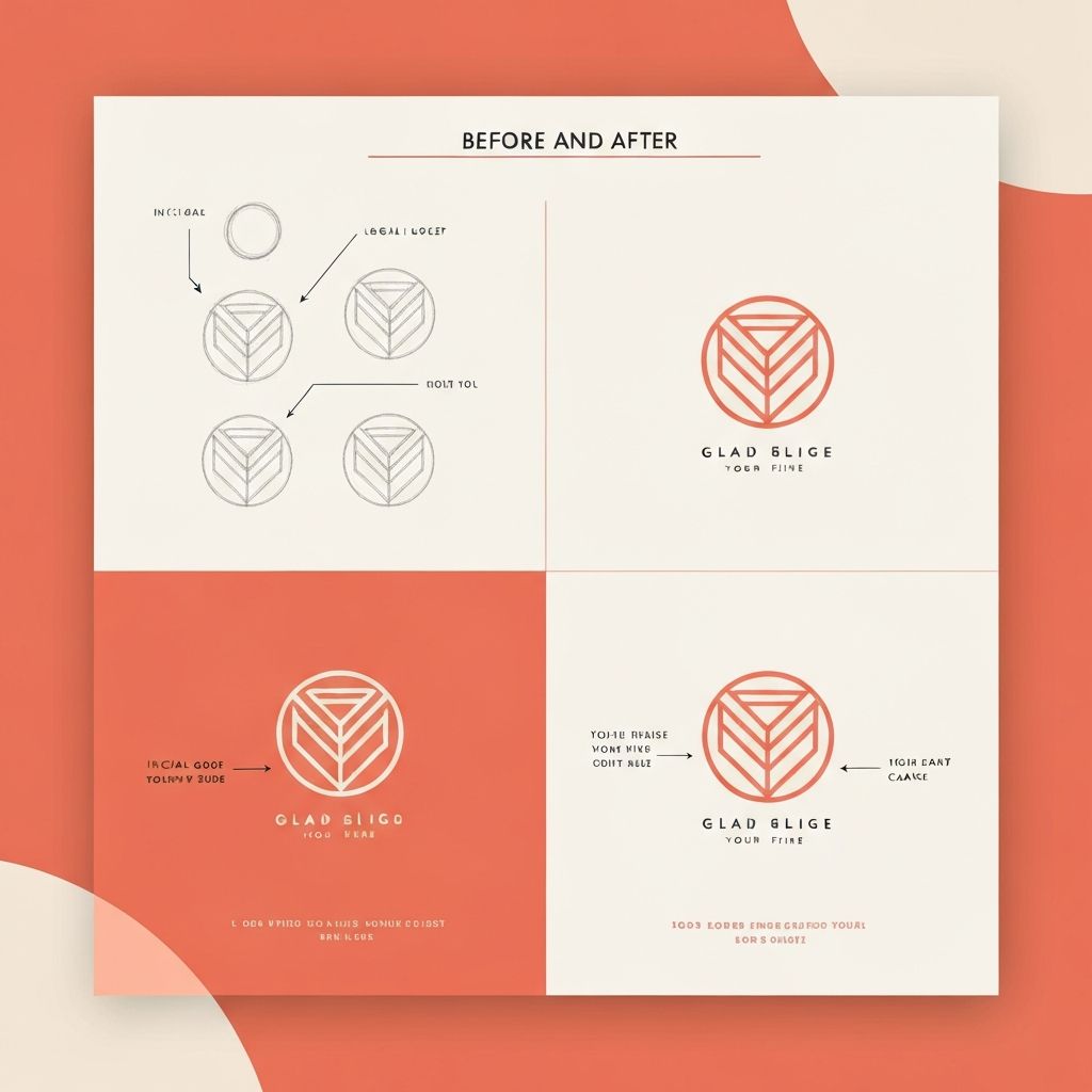
Identity Design
Developed 3 distinct identity directions over 2 weeks, presented with detailed rationale. Selected direction was refined through 4 rounds of iteration.
System Build
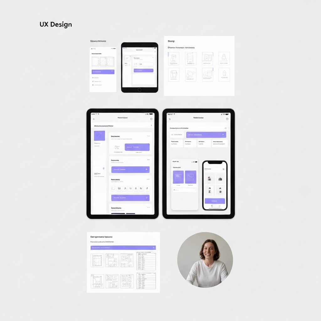
Expanded the identity into a full system: typography scale, color palette, iconography library, photography guidelines, and 80-page brand guidelines document.
Rollout
Managed identity rollout across website, packaging, social media, and retail POS materials, coordinating with 3 external production vendors.
Results
+60%
Brand Recognition
+2×
Customer Retention
72 → 89
NPS Score
+140%
Social Followers