Building Modesto Psychotherapy: A Brand Built on Science and Soul
How a complete brand identity gave a mental health practice the visual authority it deserved
+75%
Client Trust Signal
0 → 100%
Platform Consistency
56 → 90
Brand Story Brand Strength Score
+140%
Social Followers
The Challenge
The previous identity used an owl logo over a dark dramatic background with futuristic typography. While visually ambitious, it communicated the wrong thing entirely. A first time visitor could not identify this as a psychotherapy practice. It felt closer to a gaming brand or nightclub than a trusted mental health provider. The logo had no scalability, no emotional warmth, and no connection to the field it served.
The Approach
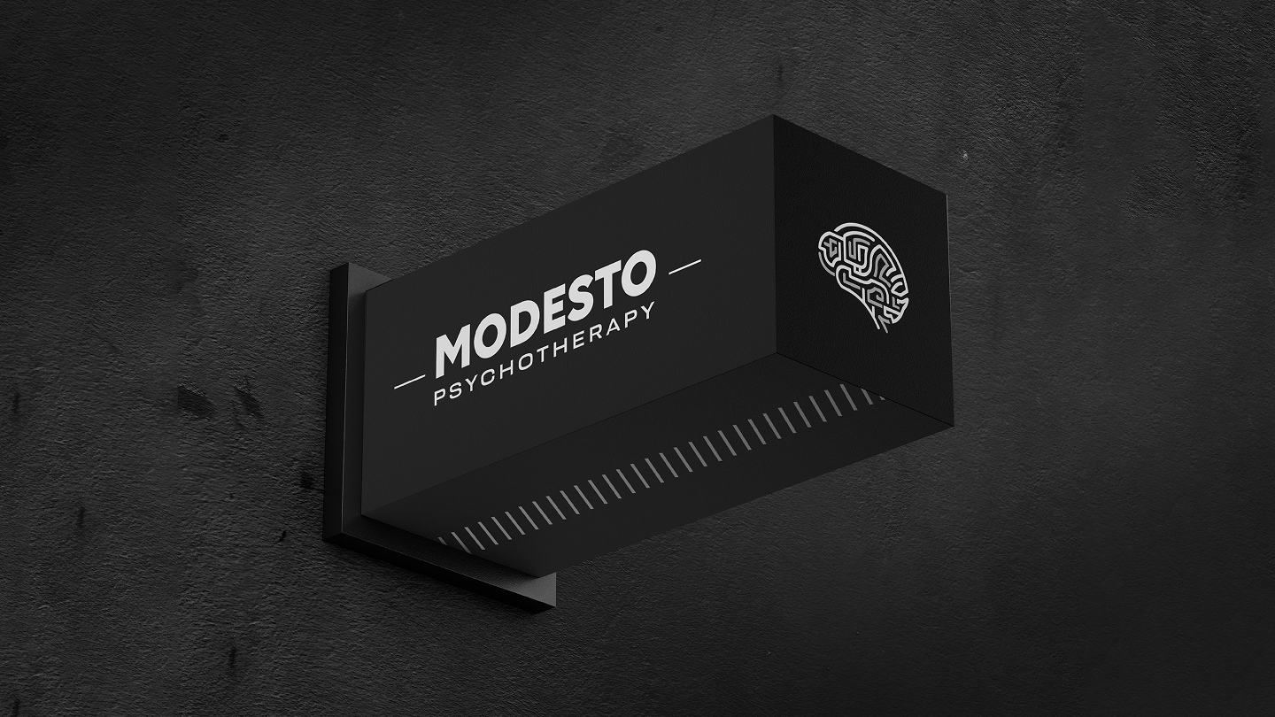
The project started with deep research into the practice, its audience, and the competitive landscape. Four distinct logo concepts were developed, each exploring a different visual direction. The client selected the bold brain mark, a maze inspired illustration that captures the complexity of the mind while communicating clarity and precision. From there the work expanded into a full brand identity system covering color palette, typography, usage guidelines, social media post templates, profile systems and brand mockups across print, digital and merchandise.
Project info
Tools used

Detailed Outcomes
+75%
Client Trust Signal
0 → 100%
Platform Consistency
56 → 90
Brand Story Brand Strength Score
+140%
Social Followers
Want results like these?
Let's collaborate to transform your vision into an iconic brand experience.
Start a project